From discovery to website design, strategy to technology and hosting, we work with our clients to enable their digital success.

Fraser Coast Tourism & Events
Driving tourism on the Fraser Coast by reimagining the brand’s digital presence and transforming the online booking experience.


Jetts
Reinventing one of Australia’s leading fitness brands’ online presence.


Harcourts International
A refreshed digital presence to accommodate an international franchise network.


Diabetes Australia
Creating an online platform that drives systemic change and improves outcomes for students in schools with Type 1 Diabetes.

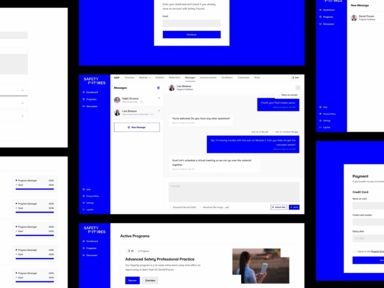
Safety Futures
Developing an engaging and efficient custom online learning solution to replace an off-the-shelf platform.


Translink
Designing a smarter way to manage and communicate disruptions across Queensland’s public transport network

Elements of Byron
Inspiring Stays Through Story

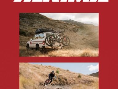

Yakima
Elevating Yakima’s online presence to support international expansion.

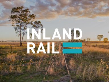
Inland Rail
Using visual cues and organisation to create a simple and intuitive content navigation system.


National Storage
Addressing customer perceptions of storage size with a visual, dynamic and relatable size guide.


National Storage
Creating a digital space for investors, serving relevant and timely content.


National Storage
Integrating specialised recruitment software to engage prospective employees.

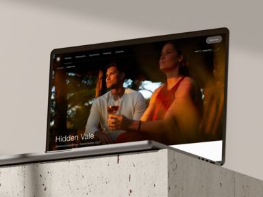
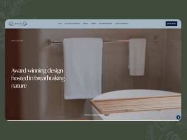
Spicers Retreats
Bringing a sense of relaxed luxury, online.


Spicers Retreats
Creating destination microsites for restaurants under the Spicers Retreats master brand.


Spicers Retreats
Creating a digital platform to accommodate adventure-seeking users with specific trip-planning tools.


Spicers Retreats
Enticing users to explore Queensland’s hidden gem, the Scenic Rim, through a highly visual website.


Spicers Retreats
Bringing a new offering online, with a focus on replicating the in-person, luxurious experience.


Wrappt
Setting the personality and visual style for the brand.


Inland Rail
Displaying key project information in an intuitive, interactive way.


Allianz Partners
Helping Australia’s leading assistance provider deliver a best-in-class digital experience by breaking away from the traditional corporate mould.
Extensive experience in digital products since 2015.
Our expertise spans UX audits, government platform applications, LMS development, and various digital tools